Bear Buns Closet
Redesign Overview
The Organization:
Bear Buns Closet is a Twin-Cities based fashion business that sells second-hand clothing, hosts clothing swaps, takes donations of clothing for swaps, and also provides branding/styling services, personal shopping, and wardrobe consulting, all with the aim of encouraging sustainable fashion choices and community connections.
The Problem:
The current Bear Buns Closet website does not reflect the current services the business provides. Users thrive on the adventure and social aspects of secondhand shopping and are intrigued by the concept of clothes swapping, but need to be able to easily learn about these opportunities on the website.
The Team: Adrian Larkin, Mia Norrish and Katie Hewett
My Role: UX designer
Tools: Figma, Miro, Webflow, Wix

Current Website
Our Analysis:
-
Unclear Purpose
-
Low-Quality Images
-
Unclear what services are available
-
Missing links are an issue

Stake Holder Interview Plan
Objective 1
Discover more about the stakeholder’s current business plan and model- how does it work, what services are offered, etc?
Objective 2
Learn more about the stakeholder’s visions and goals for their business- where are they trying to go from here?
Objective 3
Learn about Bear Buns Closet’s current customers and how they interact with the business. Do current customers have any known pain points?
Objective 4
Discover how the stakeholder sees the website fitting into their business plan. Do they have any specific wishes for the website itself?

Interview Findings
-
Her clothing swap events are where she would like to focus her business
-
The online shop is also critical, as it funds her events
-
Hoping to showcase a fun, eclectic vibe that corresponds with her inventory and customer base
-
A key goal was to create better calls-to-action to help users access her many services

Competitor Analysis
We analyzed 6 direct and indirect competitors:
-
Goodwill
-
Minneapolis Vintage Market
-
Cake Plus Size Vintage
-
Elite Repeat
-
Poshmark
Takeaways from analyzing our competitors:
-
Competitors had clear missions on their website. Additionally, Bear Buns Closet has a more multifaceted approach compared to most of the competition,
-
Many of our competitors are very well-known, which could be a challenge for standing out
User Research Plan
Objective 1
Discover more about user experiences and attitudes when purchasing used/vintage clothing
Objective 2
Discover user preferences for donating their own used clothing
Objective 3
Discover what draws users to clothes swapping events/what they are looking for in these types of events
Objective 3
Discover what draws users to clothes swapping events/what they are looking for in these types of events


User Research

Survey
We sent out a survey with our same objectives as our interviews and received 38 responses. Survey responses largely corresponded with our interviews.
Affinity Diagram
We created a few diagram for this exercise. We separated any enlightening thoughts we heard from the recorded interviews and used Miro to organized them.
-
Looking for items that help them feel unique and express individuality
-
Seeking affordability and item quality in their secondhand pieces.
-
Trust for online stores is lower, but good information, photos, and reviews help increase this trust.
-
Have heard of clothes swapping, but may not have ever attended.
-
Are likely to find out about events via social media
-
Convenience is also key, as is having enough information about the event- what sizes and styles will be available.
-
Prefer o donate to where they know their clothes will be used by people in community, and ease of donating is key


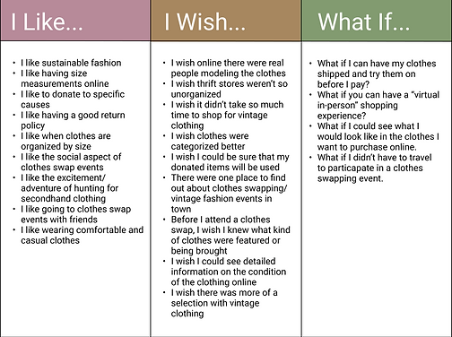
I like, I Wish, What if
Taking what we learned from the affinity diagram we used this exercise to narrow down what Bear Bun’s users would want.
Prioritization Matrix
-
Our Key Features:
-
Upcoming Events Page
-
Descriptive Information
-
Sign-up Options


User Persona
Maria Augustine is a 28-year old woman who loves the adventure of shopping vintage, and is drawn to clothes swapping because she is looking to find a unique style on a budget and stay away from fast fashion.
Problem Statement
Bear Buns closet was designed to provide a place to shop online for vintage goods as well as encourage users to participate in the clothes swapping and styling services they provide. We have observed that users thrive on the adventure and social aspects of secondhand shopping. They are intrigued by the concept of clothes swapping, but do not always know where to find these events in their area. In addition, while customers enjoy the speed with which they can shop online, they struggle to know whether or not secondhand items seen online will work for them in real life. How might we improve the Bear Buns Closet website experience so that the user is successful based on number of items purchased, number of clothes swaps attended, and services booked through the site?
Ideation
Storyboard
Maria comes across Bear Buns Closet on Instagram. Our storyboard shows her experience signing up for and attending a clothes swap to refresh her wardrobe.


Sitemap Before Redesign
The original sitemap was sparse, and didn’t include many of the services the stakeholder needed to highlight on the website

Incorporating New, Rearranging
We worked to incorporate the stakeholder’s needed information into categories

Final Iterated Sitemap
And condensed multiple sections of information onto individual pages
Prototyping


Usability Testing Plan
Task 1
Can the user - find information about upcoming events?
Task 3
Can the user find out how Bear Buns Closet could help them host their own clothing swap?
Task 2
Can the user find where they would go to buy an item of clothing on the site?
Task 4
Can the user find where there would sign up for email updates?


Iterations After Usabililty Tests
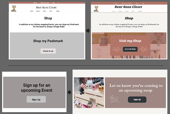
The user was unclear on what Poshmark was. The solution was to include the the stakeholders Poshmark store washed out in the background.
“Sign up for an upcoming Event” wording was confusing.

Iteration
Users thought the first “About Me” we design was too long and overwhelming so we took away a section we thought wasn't needed and reduced the scrolling.
Iteration
Users were confused by "Guides" page. They were unsure what was free vs. paid. We also shortened the scrolling as well.

Style Tile

We sought to create an eclectic and fun feeling to reflect the desired shopping experience with a multi-colored, color-block design. The vintage-inspired fonts tie in with the business’s offerings and the botanical accents reflect the sustainability goals.
Initial Hi-Fi Design


Navigation updates:
-
We updated the nav order to better reflect user priorities and business needs: Home, Shop, Services, Events, Guides, About
-
We added a tagline to make it clear what site was
-
We put a larger month on the calendar with lines and darker font and time and location of events listed
-
Adding a Poshmark logo on the "shop" page as a button and updating the language gave the user more clarity
More Hi-Fi interation
-
There was too much scrolling still on services page and we shrank the size of the elements
-
We added a services description on the hero image
-
Added email subscription option to the contact page
-
Added business location to footer

Conclusion and Next Steps
-
Continue working with stakeholder to build live site using Wix CMS
-
Building additional pages including blog, signup options and booking and checkout functions
We will track the KPIs over time using analytics to see if our design is functioning as intended- specifically items purchased through the store, event sign ups, and services booked.